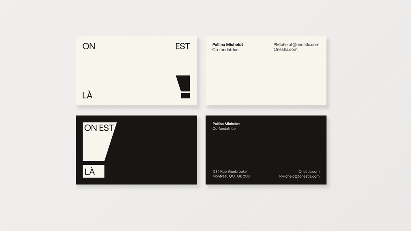
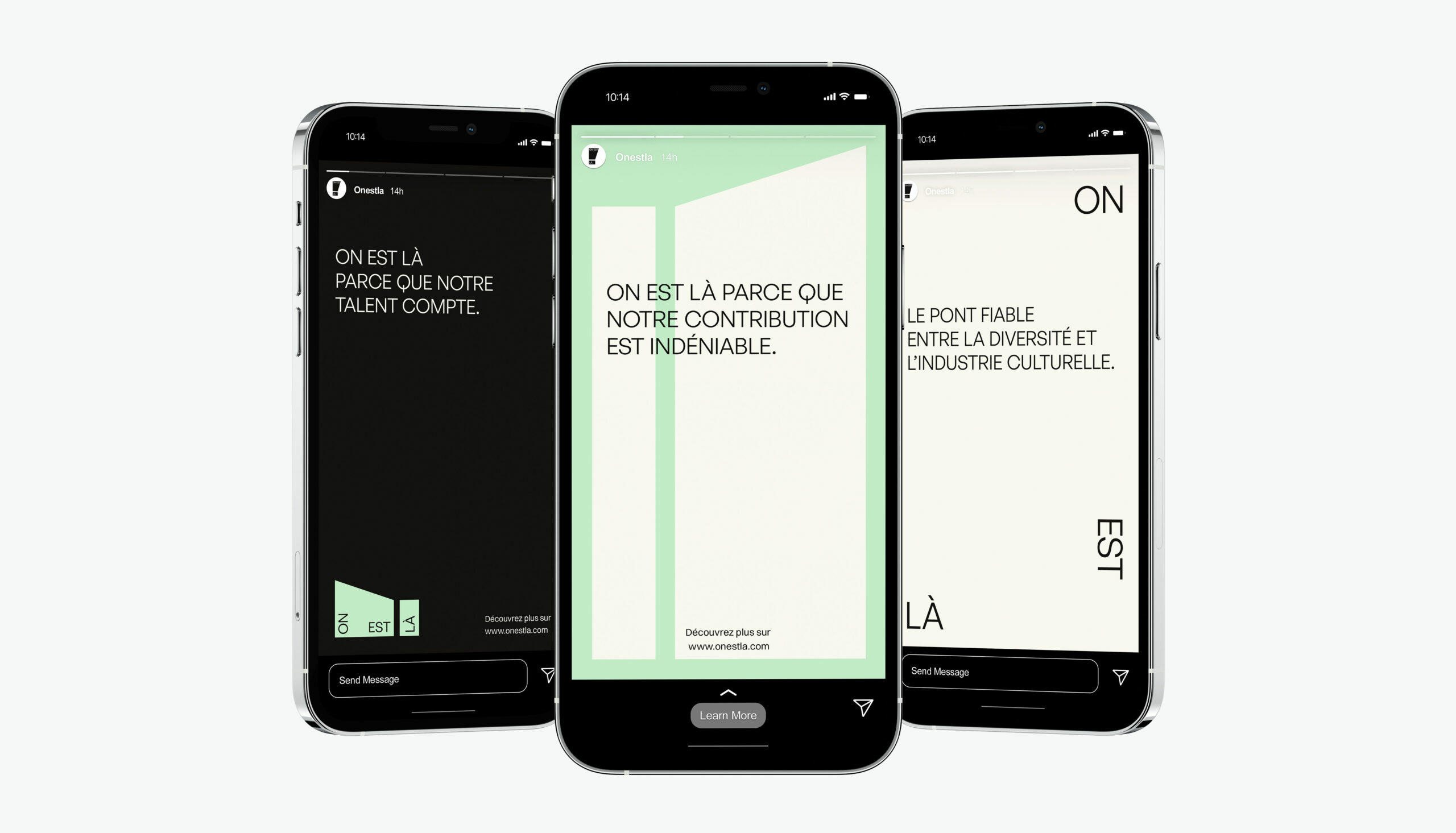
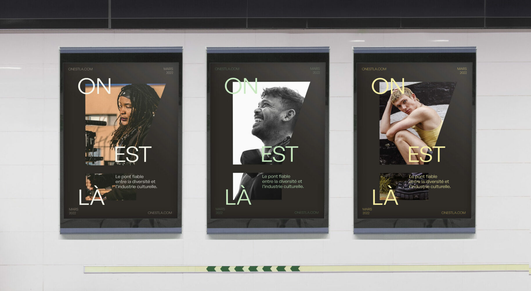
Using the agency’s name as a reference point (“We are here” in French), we built a brand identity that doesn’t shy away from bringing attention to itself.
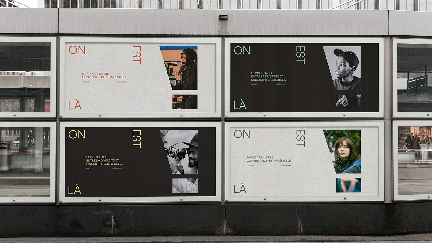
We wanted to convey the idea that “we”, the talented professionals from diverse communities, are not only here, but we are everywhere, we always have been and always will be, unapologetically.
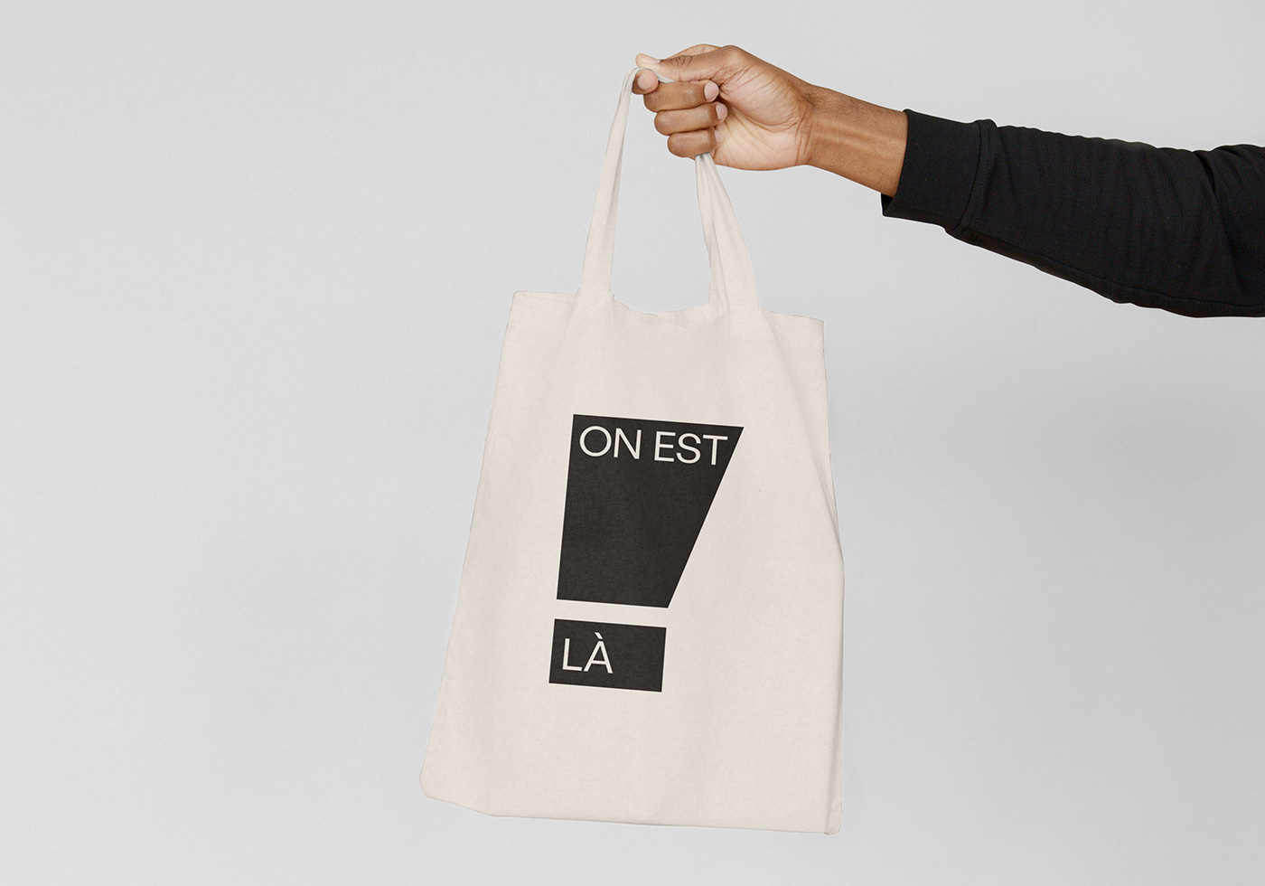
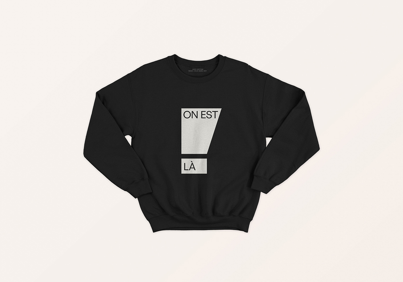
A bold, sharp icon inspired by the exclamation point was designed to do just that. We paired the icon, which when rotated can also be interpreted as a megaphone, with a timeless yet modern sans serif font playfully used to represent diverse talents taking up the space they deserve.
Knowing that the agency wanted to champion diversity in all its forms with a particular focus on indigenous people, we also paid homage to native professionals with the subtle use of a colour palette inspired by the medicine wheel.


